Last week, I had the pleasure of speaking at the Blockchain Convergence Summit in Seoul. With more than 2000 people attending from all over the world, it really was inspiring to see how many people take an interest in blockchain and its future potential.
The two day event featured talks from many different projects and companies. A recurring theme throughout the event was that of improving usability – making blockchain more aesthetically pleasing and user-friendly, in order for people to want to use and interact with it.
Along with this, comes another important point – one which my talk was based on, and one which should be put of equal importance for businesses in the industry. That is: the importance of branding. That is to say, the importance of a clearly defined purpose – a purpose that really gets to the core of what your business is about, and which allows a brand to be built upon that.
The importance of branding
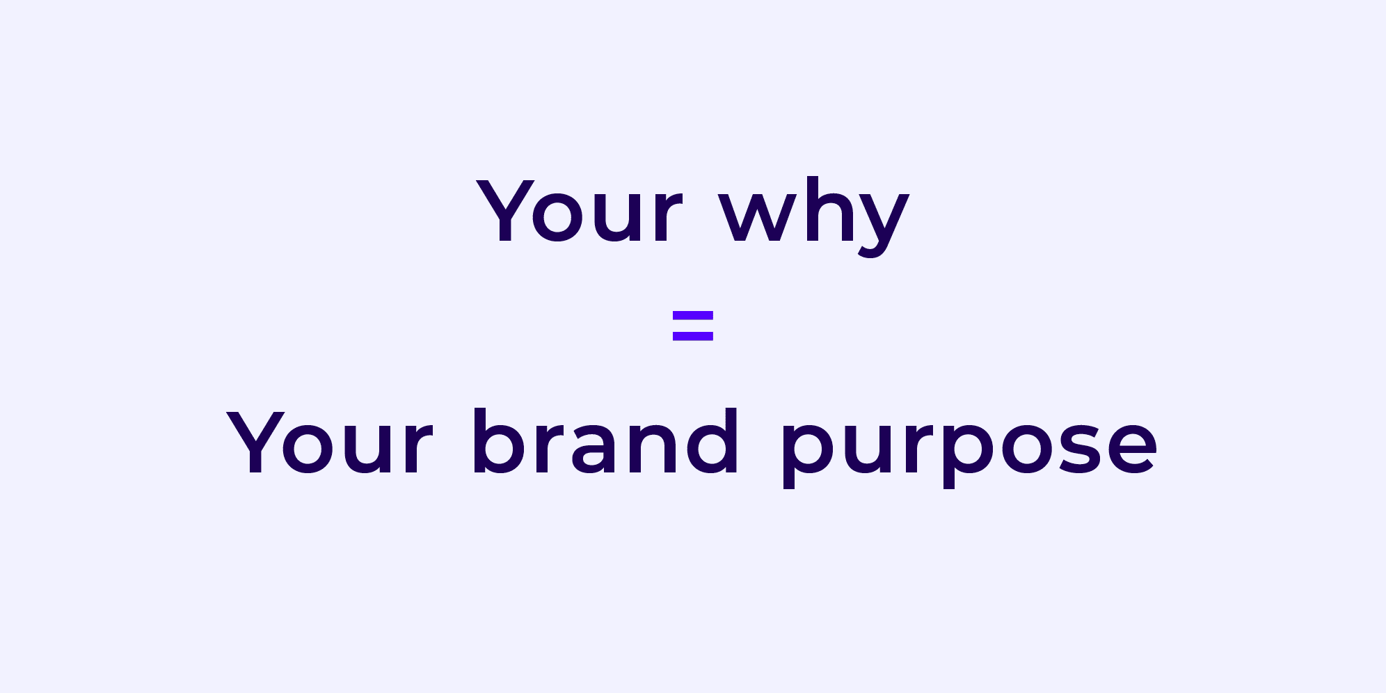
A brand is more than just a logo or a symbol. It is an idea, a message, a way of life, something that leaves a mark on us… Essentially, a brand is the personality of a business. It is what differentiates you from everyone else. Companies use branding to communicate what they represent and why it matters, and it is this why, that is your brand purpose.

Do it on purpose
A brand purpose is a reason for being. For a purpose to be effective, it needs to guide everything a brand does, not just what it says. When a brand lacks a clear purpose, it lacks direction; and a lack of direction hinders engagement.
Where brands are purposeless, it’s harder for them to connect and differentiate. Forward-facing businesses see the power in differentiating themselves. They use branding to communicate what they represent, and why it matters. Corporate brand needs to truly represent the business, how it works, its people and its culture.
Finding your purpose is important in any industry. Within this industry, specifically, there are a couple of reasons why it should be a priority. In a fast-paced industry that seems to change from one week to the next, it is important for companies to appear established. This evokes trust and it is this trust that gets positive engagement. It creates a following from users who understand where a business is coming from, and what it’s trying to achieve.
For Ethfinex, in particular, there was a need for us to appear established right from when we launched. With so many exchanges out there, that share similar features, it was important for us to differentiate ourselves through our purpose.
The Ethfinex purpose
“People don’t buy what you do, they buy why you do it.”
– Simon Sinek
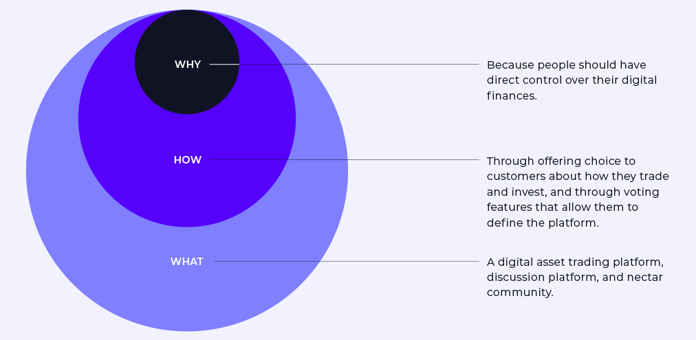
Why explains the reason for your brand existence. In order for us to get to our purpose, we started at the why of our business, instead of focusing on what we do or how we do it. This comes naturally once the why is there, and there will be more motivation and emotion behind your what, once the why is established
The Ethfinex why?
– Because people should have direct control over their digital finances.
After the ‘why’ had been established, we were then able to elaborate on our ‘what’, and our ‘how’. But it is the why that really differentiates a company and defines their driving force within the industry.

The visual identity
Once a company has established a brand purpose, they can then start looking at all the different components that make up a brand. A brand consists of many components – surroundings, services, products, behaviour, communication and visual identity. These are all of equal importance when setting out to define the brand.
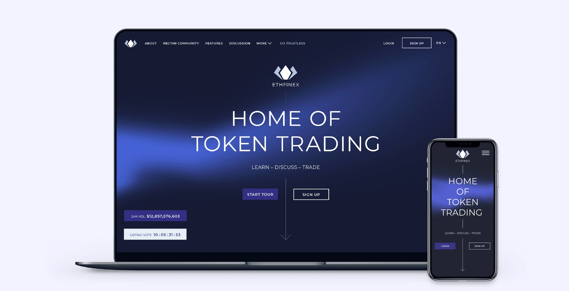
One that has been a major focus for the Creative team at Ethfinex, is the visual identity. Paul Rand, a famous modernist designer, states that ‘design is the silent ambassador of your brand’. It is the thing that people see first, that leaves an impression on users and becomes your trademark.
The Ethfinex logo
Defining a visual identity required us to go back to the foundation of our business. A logo is an important aspect, as it provides an identity that can be built upon and developed. The Ethfinex logo is a symbol of a lotus flower. A lotus flower which evokes calm and stability. The lotus flower sits on a river. The river represents liquidity, which is the essence of an exchange.
With this in mind, the foundations of the logo were laid and we were able to pair the symbol with a simple and modern font to create a modern logo.



The Ethfinex wave
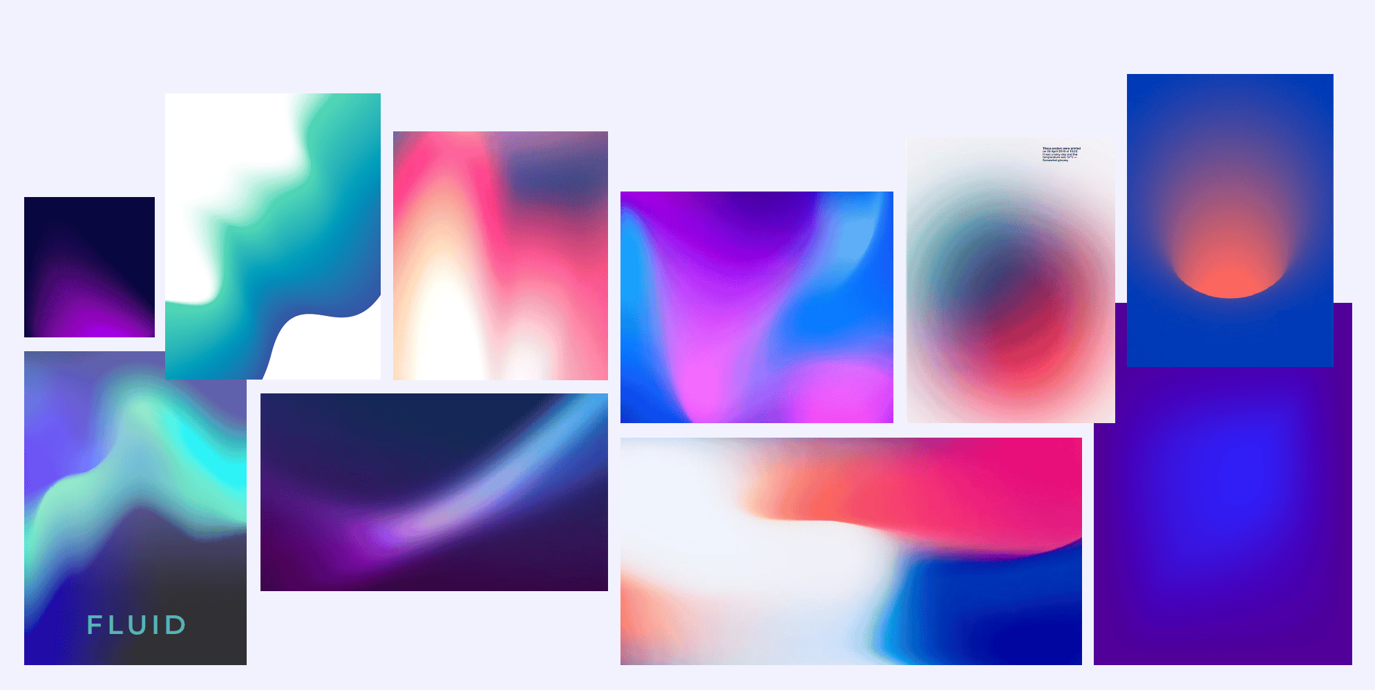
The logo development is one thing, and once done, enables a company to look at additional visual assets that make an identity unique. As a result, The Ethfinex wave was born. This wave took inspiration from the symbol of the lotus flower on the river. It represents a calm wave-like movement that is ever-changing, much like the nature of our business – responding to change and needs of our users.



The colour palette
A colour palette is another important aspect of a visual identity that is important to get right from the start. From doing competitor audits, we saw that blue was a common colour to use within the industry. If you look outside the industry, blue is a popular colour to incorporate into your brand – look at Facebook, Twitter, and PayPal as an example. Blue evokes trust and it is a calming colour.
Our purple colour palette was developed from wanting to stand out and differentiate ourselves. It is a mix of the trustworthy blue and a vibrant and energetic red to give a unique purple palette, representing both our tight security as well as our commitment to building exciting products for the future
A secondary colour palette was developed to bring in some vibrancy and depth. A secondary palette lets you take the feeling of the brand that you’ve established, a little further. It is a great way to vary your expression, however it should still feel like YOU.


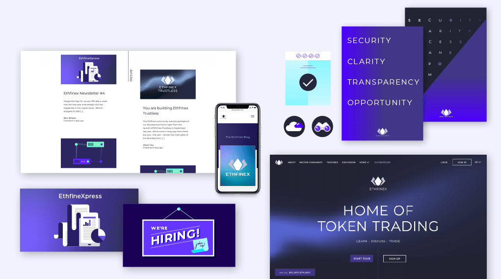
Illustration as a tool for storytelling
Once the basic principles of our brand had been established, we were able to start looking at different visual assets that would add value to our visual identity
Increasingly, illustration is being used to express brand purpose. An illustration system is a way to enrich a brand’s visual language and is more nuanced than a logo, colour scheme, typeface, or even words.
Illustration has the ability to reimagine reality in a way that is familiar. Illustration can be used to keep a consistent style, whilst adding a fun layer to a story. It helps communicate a message. Most importantly, illustration is an effective way to unify a brand across multiple areas, from product to website to blog and beyond. With this in mind and with the colour palette considered, an illustration system was developed to help tell our story. The system incorporates smaller icons and bigger illustrations. A distinct yet flexible style, that complements the Ethfinex brand promise.


The nature of branding in a fast-paced industry
Developing and maintaining a brand is a never-ending journey. A visual identity should not be a prison for your company. It is an important asset, one that will evolve as your business evolves. It should act as a helpful reminder of how you should position yourself.
In a fast-paced industry, like ours, we must be open to change and new opportunities that may arise. Your purpose should be used a guiding star – forever pursued, but never reached. Even though the purpose itself does not change daily, it does inspires change daily. The fact that your purpose may never be fully realised means that an organisation can never stop stimulating change.
People who understand your story will also understand your ‘why’, and will keep coming back to you. And that is why, at Ethfinex, we are always driven by our ‘why’.
